


Royal Mansion at Atlantis the Royal named 'The most expensive hotel room in the World'
20th March 2024 | Hot off the press
The G.A Group’s unique capability to develop brand identities in sync with interior design narratives for hospitality development is a strength that is displayed beautifully in our work for the recently opened JW Marriott Hotel Nara.
As G.A’s interior designers developed the schemes for public spaces, guestrooms and F&B areas, G.A Brand Design worked alongside the interior design team to create three stunning brand identities for the hotel restaurants.
G.A Brand Design began with logo concept development, the key for them was to ensure that each F&B area had its own identity that reflected and supported the interior design, allowing guests to enjoy the different moods and atmospheres laced into the design narratives of each space.
The three F&B areas within the JW Marriott Hotel Nara are Flying Stag –the lobby bar, Silk Road –the all-day-dining restaurant and Azekura –their speciality restaurant.
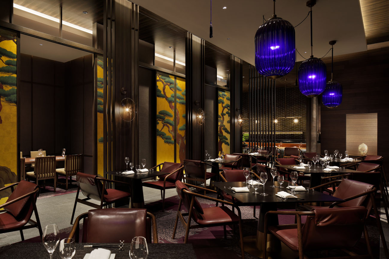
Flying Stag
The Flying Stag logo concept development was inspired by the Sika deer, which are native to Nara. This is further emphasised by the interior design details featured in the bar and lounge area, which include a dramatic artwork depicting a majestic stag.
An elegant serif typeface was created that compliments the space and the art in the lobby and reiterates the sophisticated design of the interiors.
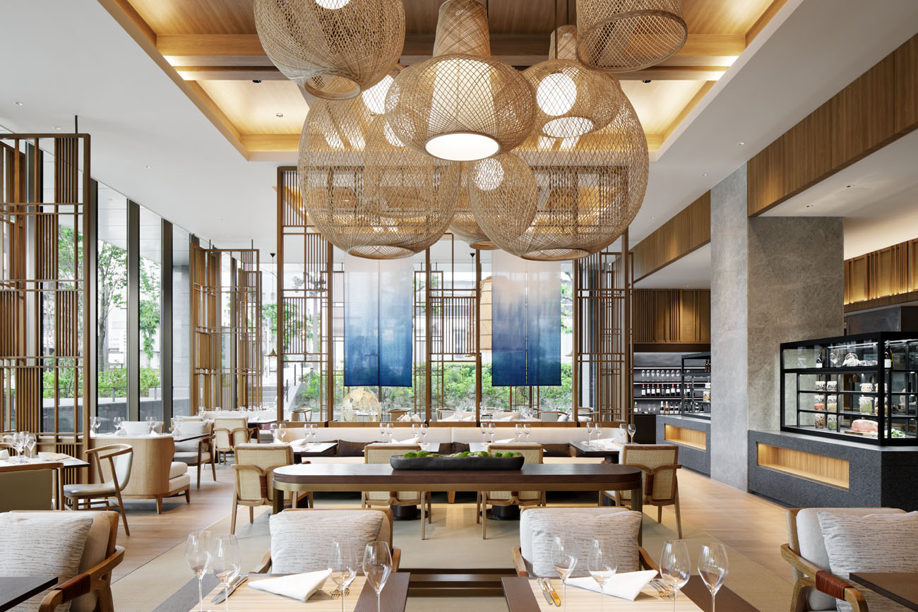
Silk Road Dining
It is believed that Nara was the final stop on the famous maritime ‘silk road’, Silk Road Dining, the hotels all-day-dining restaurant, references this historic trade route in its interior design, using beautiful woven lights and rugs as an analogy for bringing various cultures and people together. Weaving became a strong arch in the development of the logo for Silk Road Dining, the brand team developed a logo inspired by sashiko-ori an ancient stitching technique local to the region. Layers of concept development and appreciation of stories have been weaved through this space to create a harmonious brand identity.
Silk Road Dining, JW Marriott Hotel Nara's all-day-dining restaurant
Azekura
The speciality restaurant Azekura takes inspiration from the nearby Toda-ji Temple which is home to the personal treasures of Emperor Shomu. The typeface developed for this restaurant draws on the triangular interlocking wood beams of this treasure house.
Alongside the three distinct logos created for each restaurant, beautiful menus were developed that further emphasise these specific brand identities and in turn, create a sense of belonging within each restaurant. Tying everything into the feeling of relaxed elegance and Japanese style that the hotels’ interiors exude.