


Royal Mansion at Atlantis the Royal named 'The most expensive hotel room in the World'
20th March 2024 | Hot off the press
How do you create the perfect experience? This is one of the challenges that American Express sets themselves on behalf of their Centurion Cardmembers. Members receive invitations to an exclusive portfolio of events, curated by AmEx, which afford them access to incredible music, sport, food, and art experiences. G.A’s role was to create a communications strategy specifically for their Hong Kong division, one that was fitting for the brand, and its members.
The solution was a high-end quarterly brochure; an emblematic key to unlock the special events, with this idea of access becoming the springboard for the overall design concept.
The name for the publication: Paragon, defined as a person or thing that is regarded as a perfect example of a particular quality.
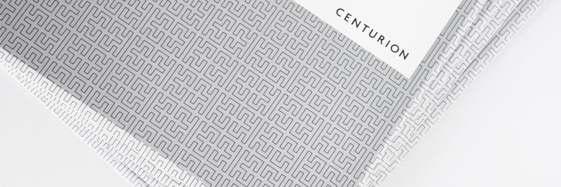
It was important for the premium experience to begin as soon as the members received their copy. The envelope is designed to feel as if opening it is like unwrapping a gift; the linear pattern, printed on a smooth thick vellum, reminiscent of luxury fashion brands.
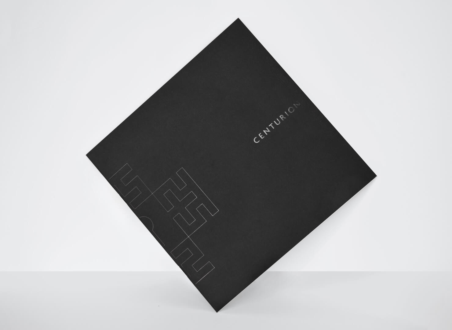
On the cover, the Paragon logo, both a geometric interpretation of a key, and the letter P, wraps around the spine of the black matte cover, in black foil. A discreet detail that suggests a secretive element to the brochure, but also hints at the quality of the product. The tactility of the materials playing an equally important role.
Inside the brochure, the clean, minimal design continues. There is a calmness and sense of order. Much like the bespoke nature of Paragon’s events, everything is artfully and purposefully done.